Current State Of Play
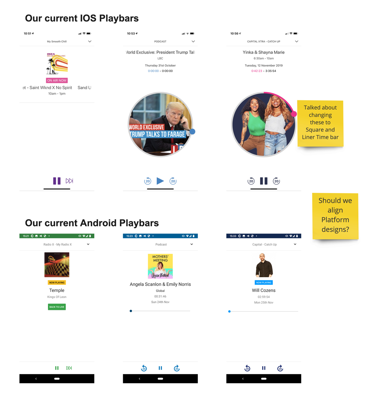
We did not currently have feature parity across our platforms.
Without a consistent expanded player available for all media types, this would cause both confusion and inaccessibility to future features across our platforms.
This was the first thing to address and scope what needed to be done to get the basics there.
Where is what
Quickly at a high level explain the problem and architectural gaps.
The Current UI
A quick gathering and later analysis of what the UI and UX was on IOS and Android.
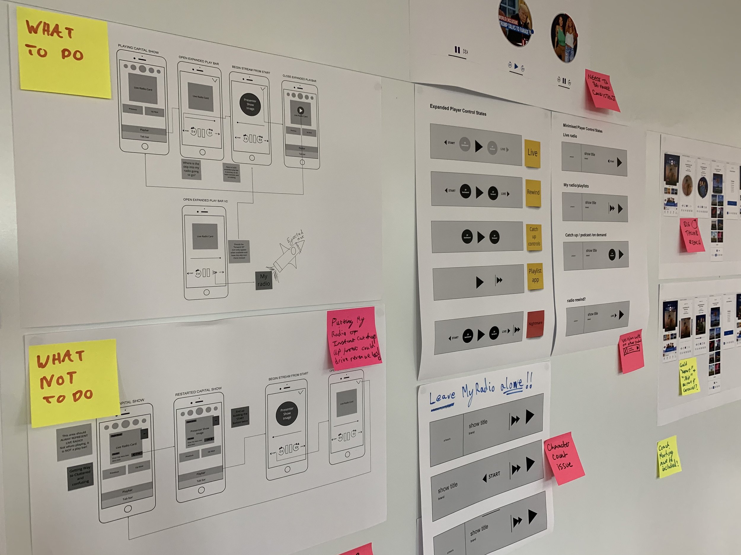
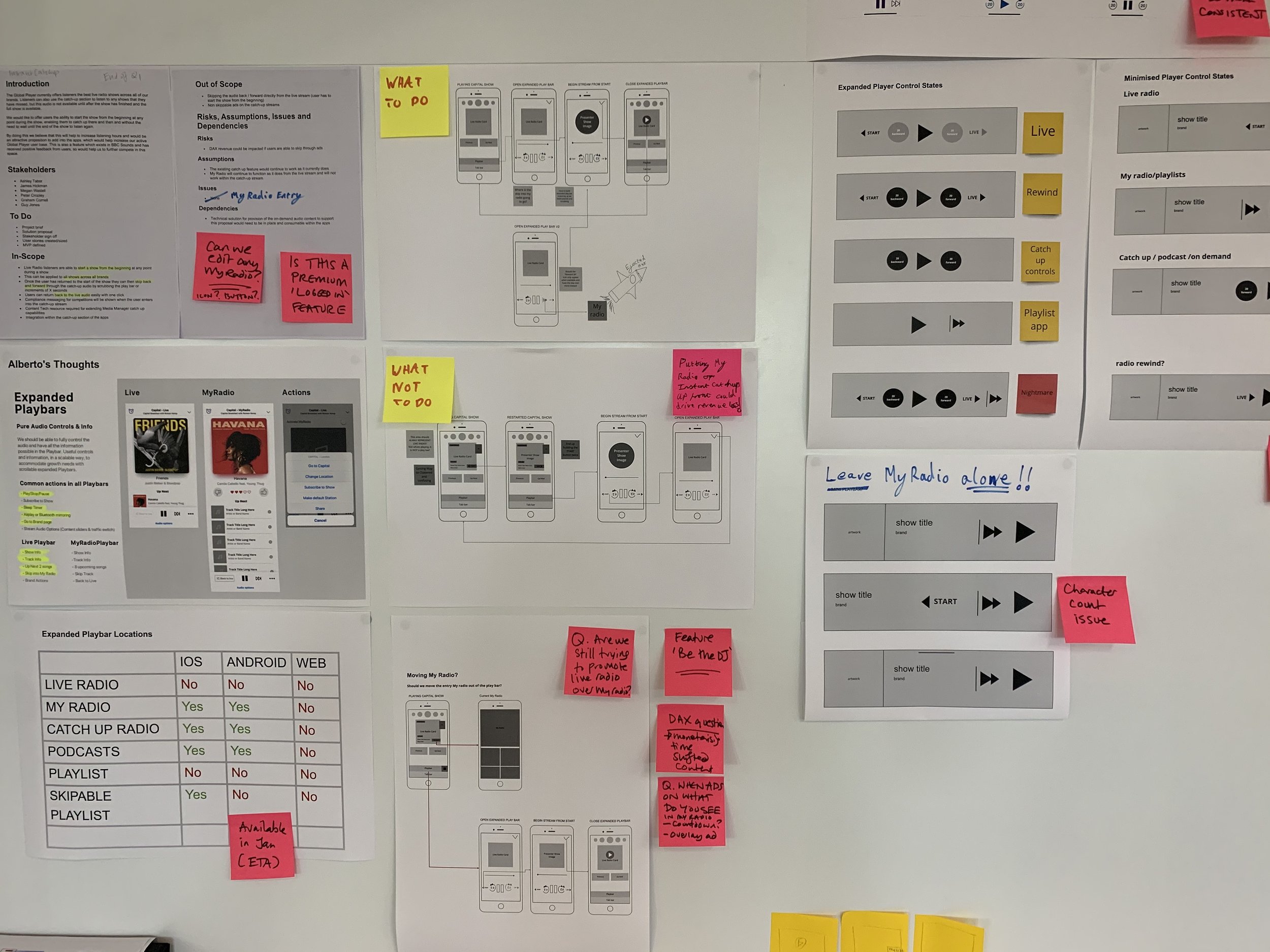
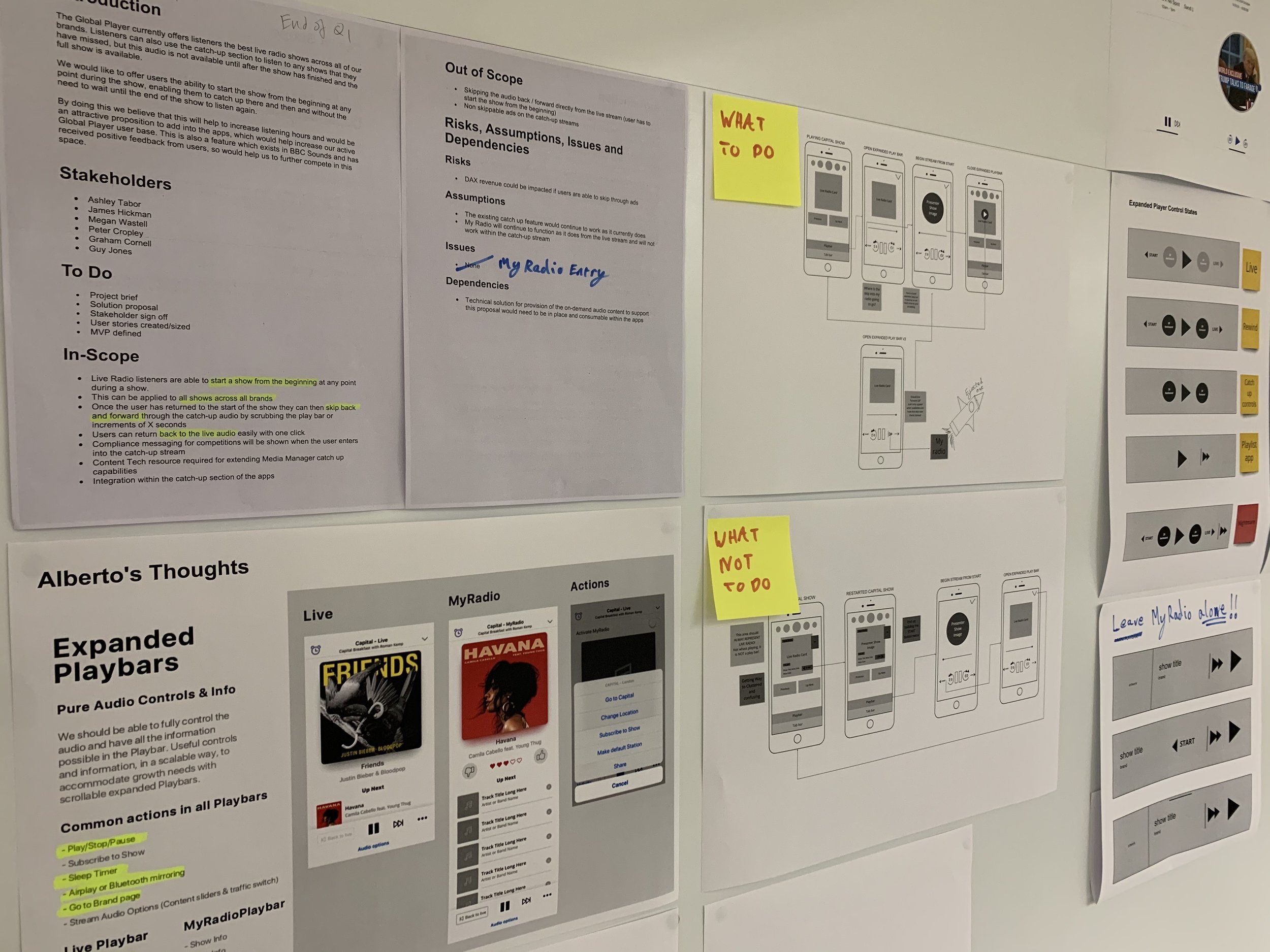
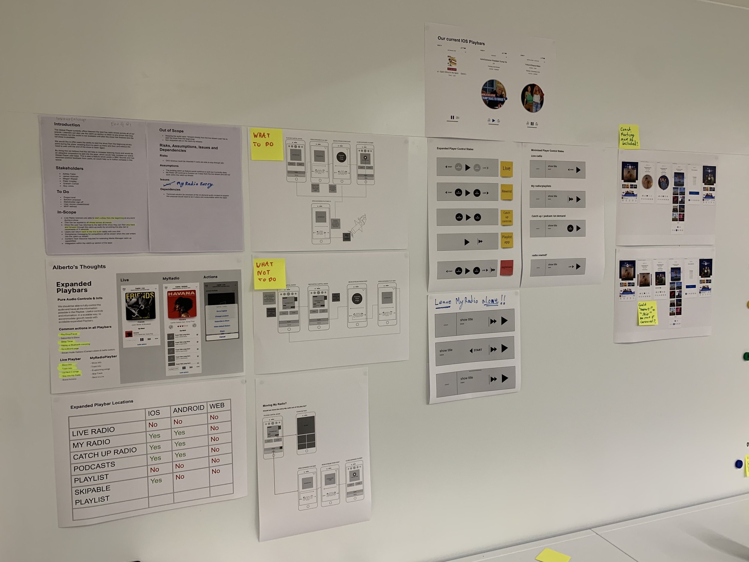
High Level Flows
Due to the original business ask for a specific new feature, which cause this analysis and the birth of this alignment piece.
We had do make sure we were driving and discovering product improvements whist focusing on the business ask simultaneously.
One of the complication we had with the Live Radio Playbar was a feature known as My Radio.
This feature lets you skip forward the track being played on the radio currently.
This is great, but the experience currently lives outside the playbar and on a new app page.
This meant even if we made a Live Radio Playbar, that experience would also need to be moved.
And so the Tech Debt continues to build…
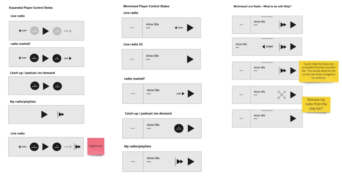
Mapping Play Control Across Media Type
Break Point
So at this point in the project there was a huge amount of focus still on trying to get existing and new time based functionality working together.
Numorous prototypes where made to try to explain what would need to go where.
The reason I’m not going into mass detail about this is because that isn’t where the project ended up going.
Can see bellow an image of one of these journeys. (Video to come)
Button Design
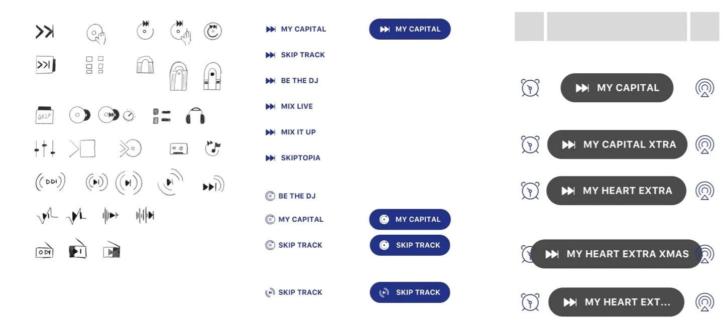
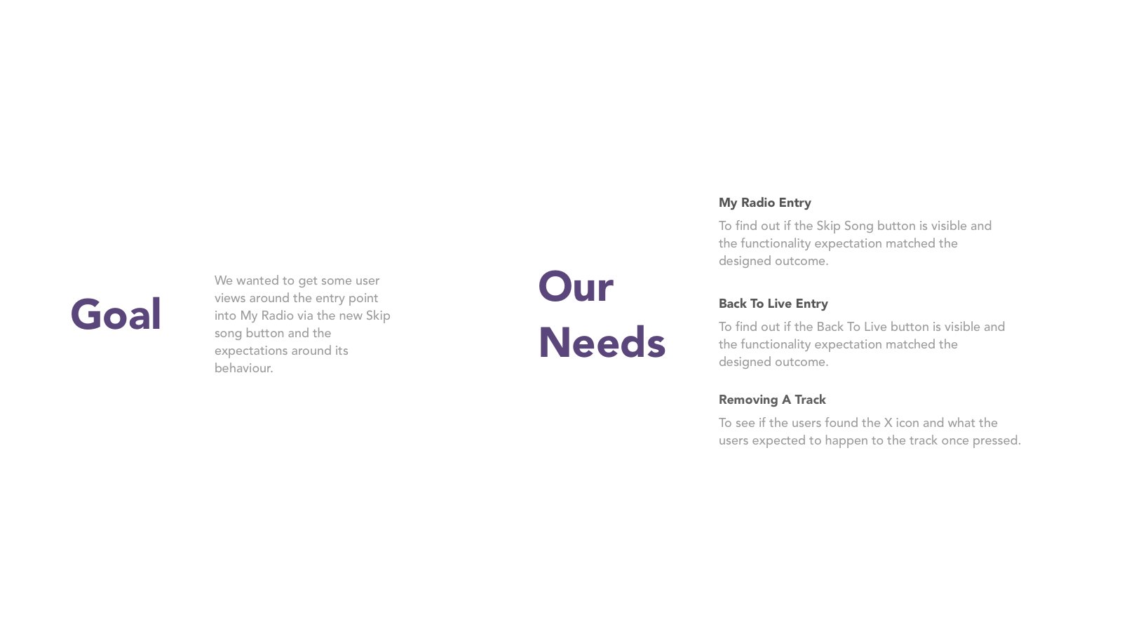
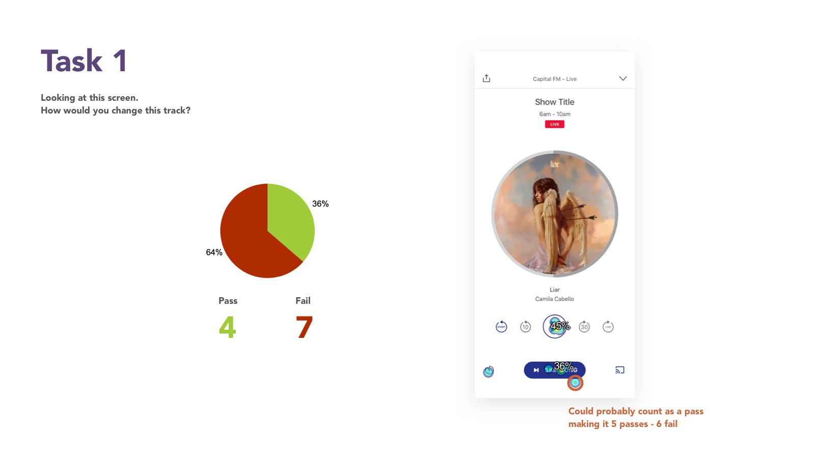
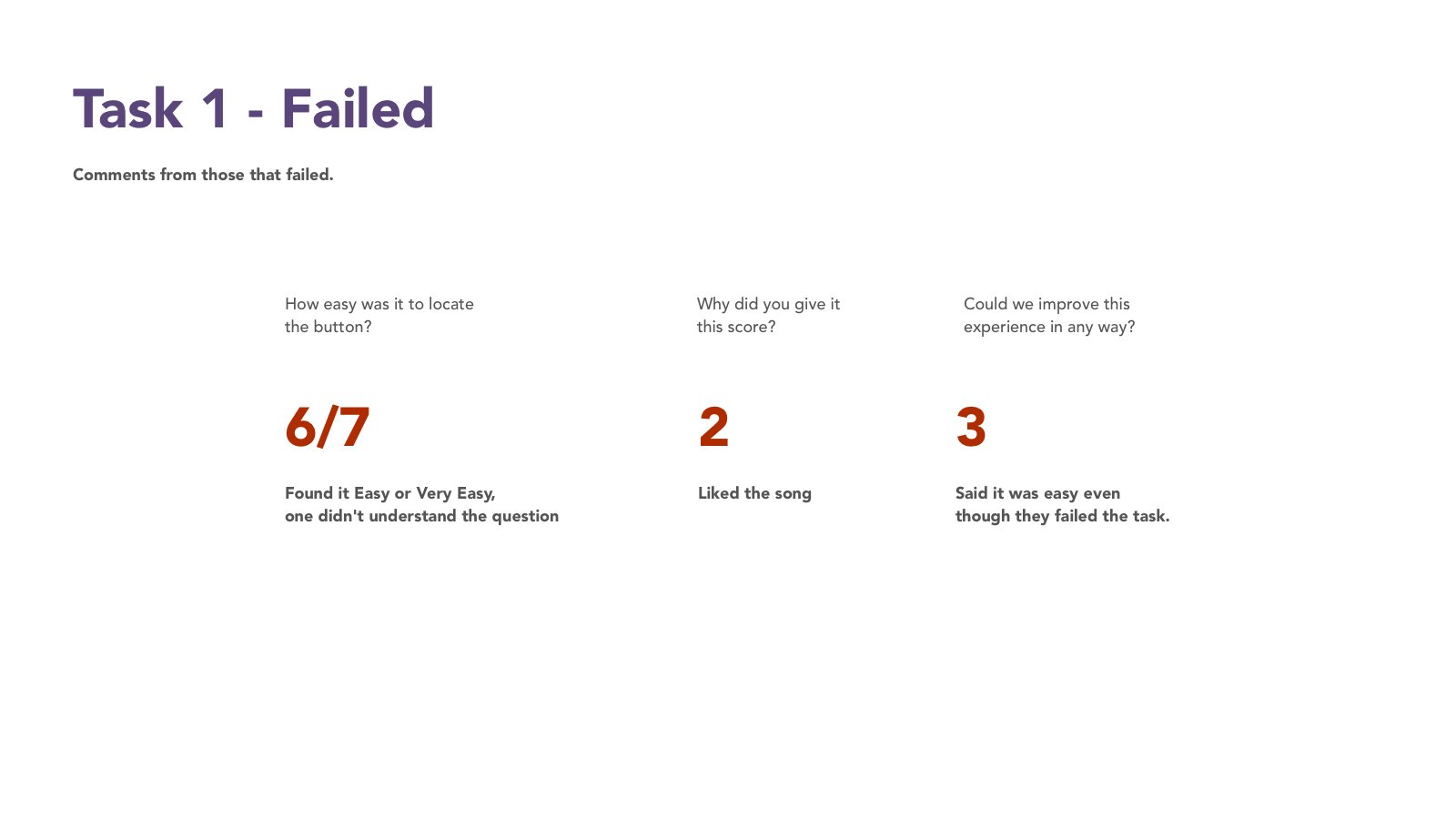
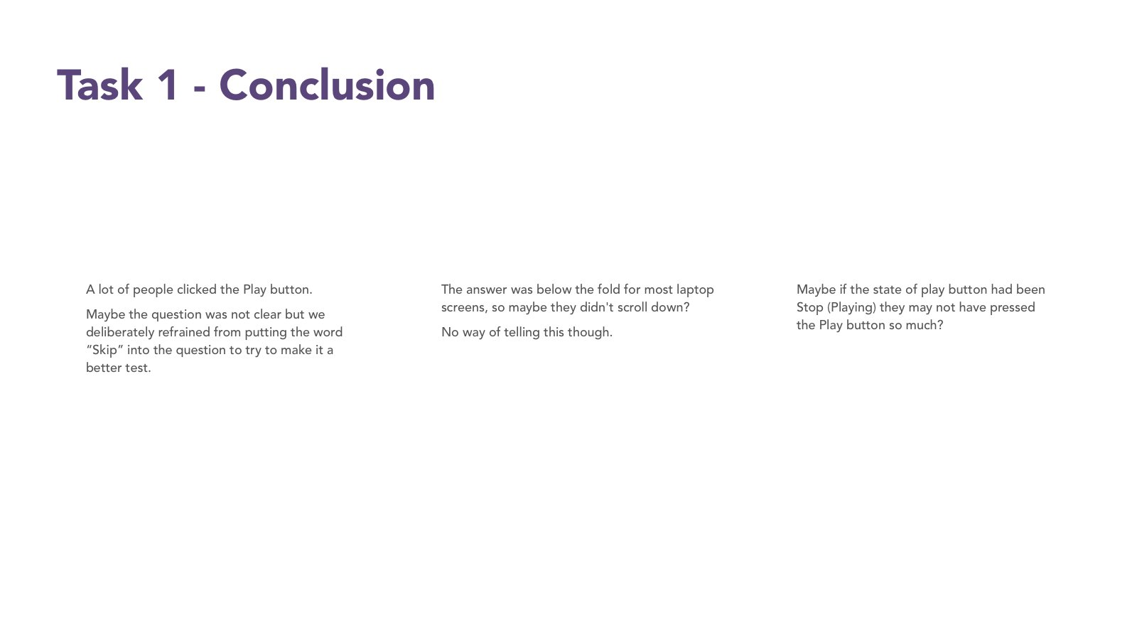
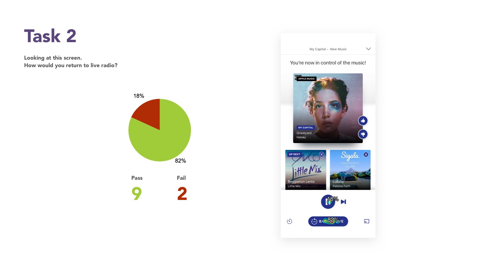
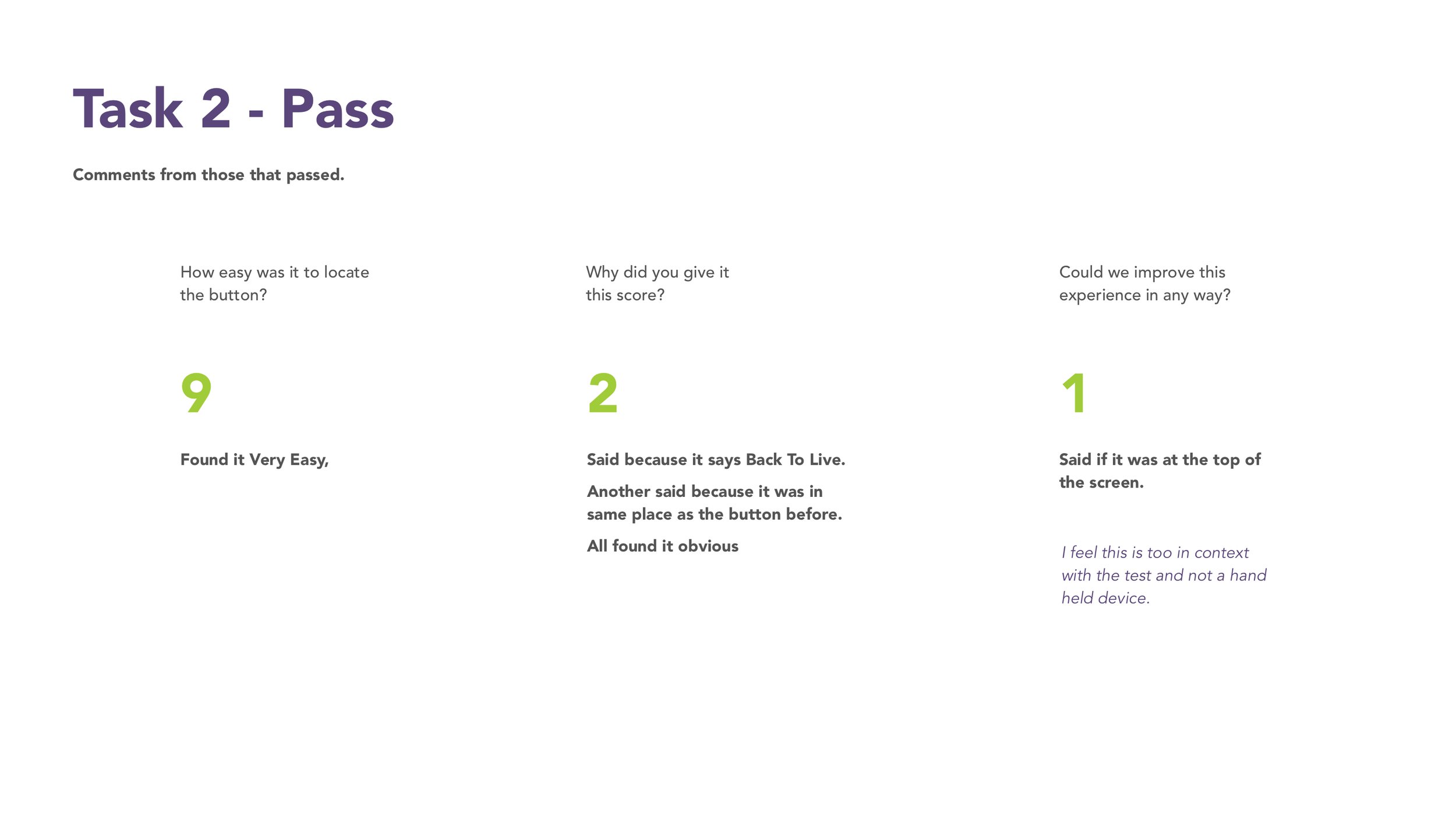
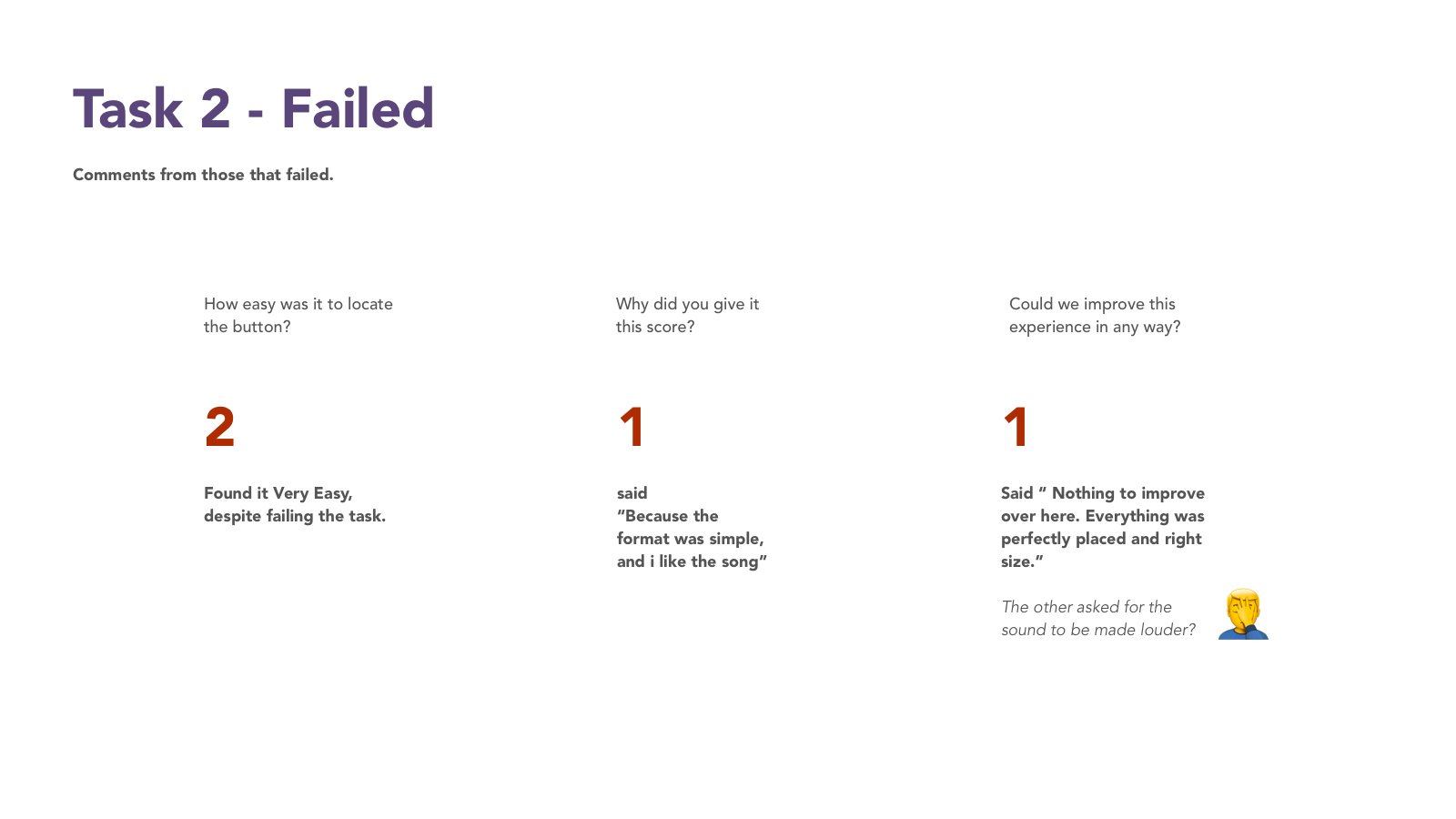
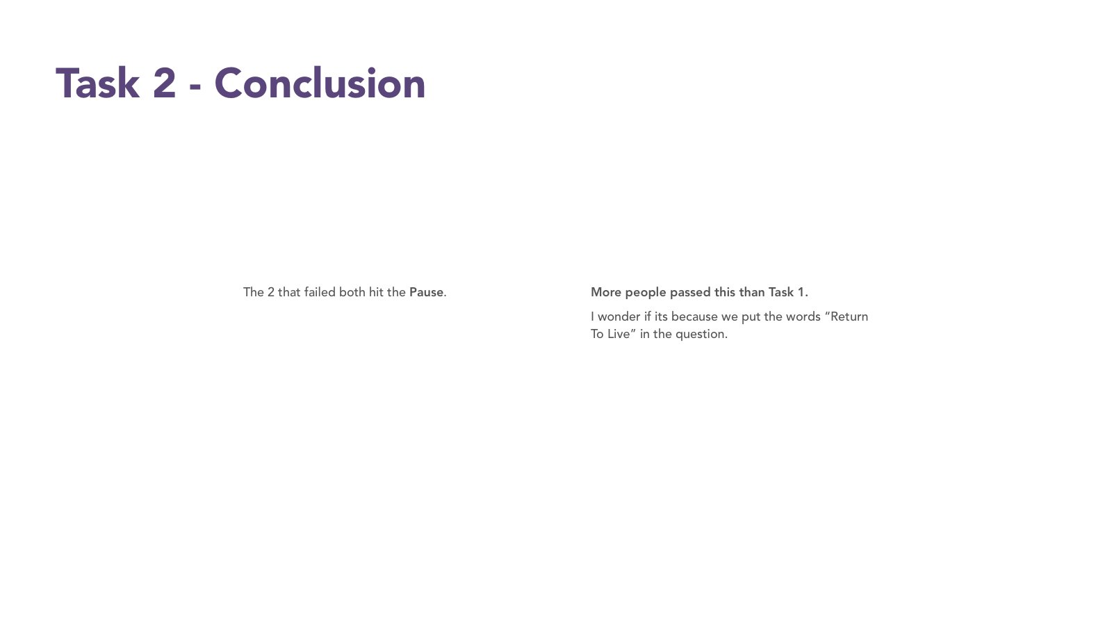
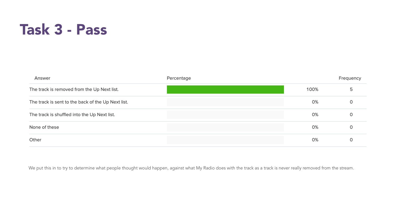
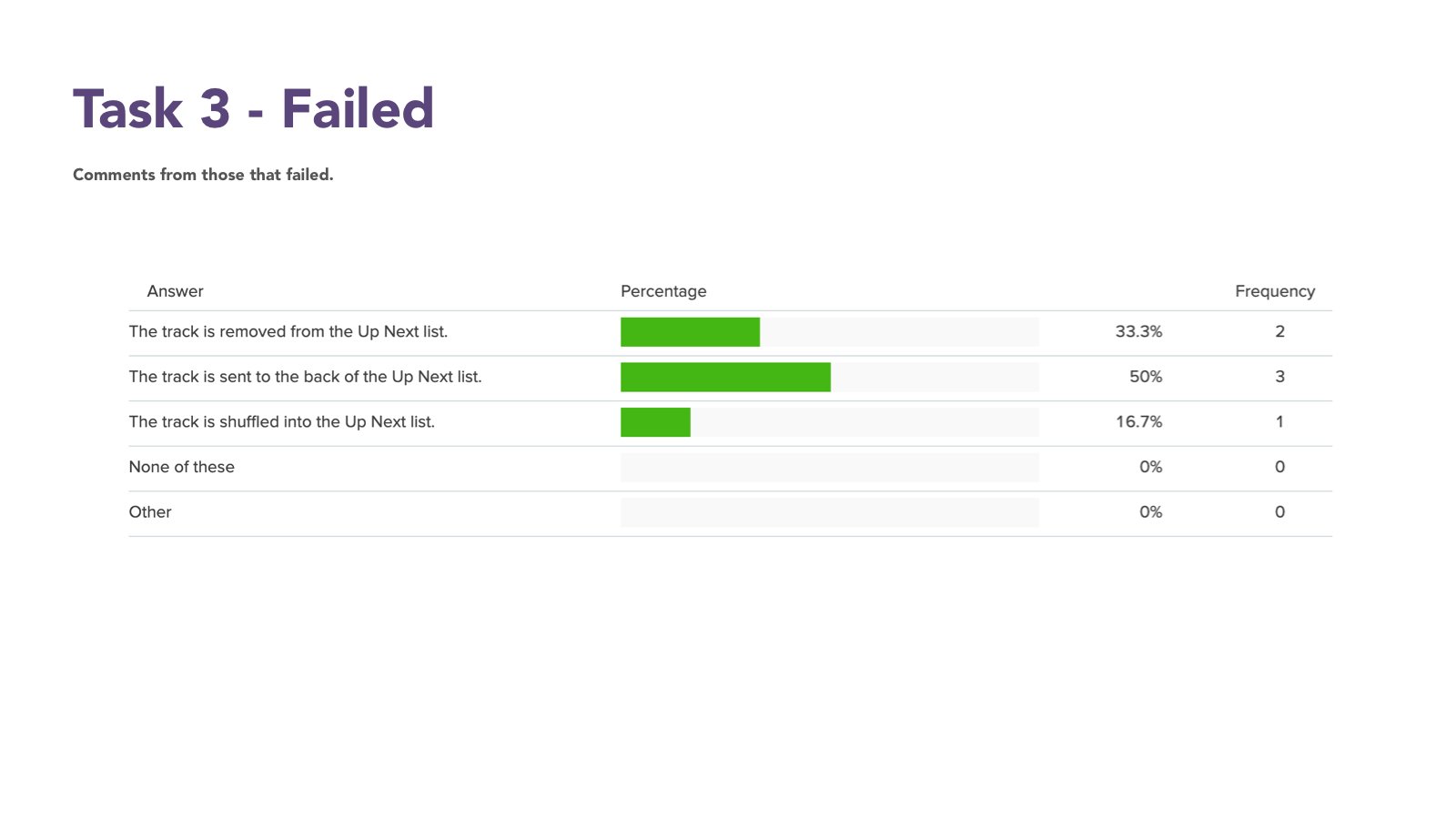
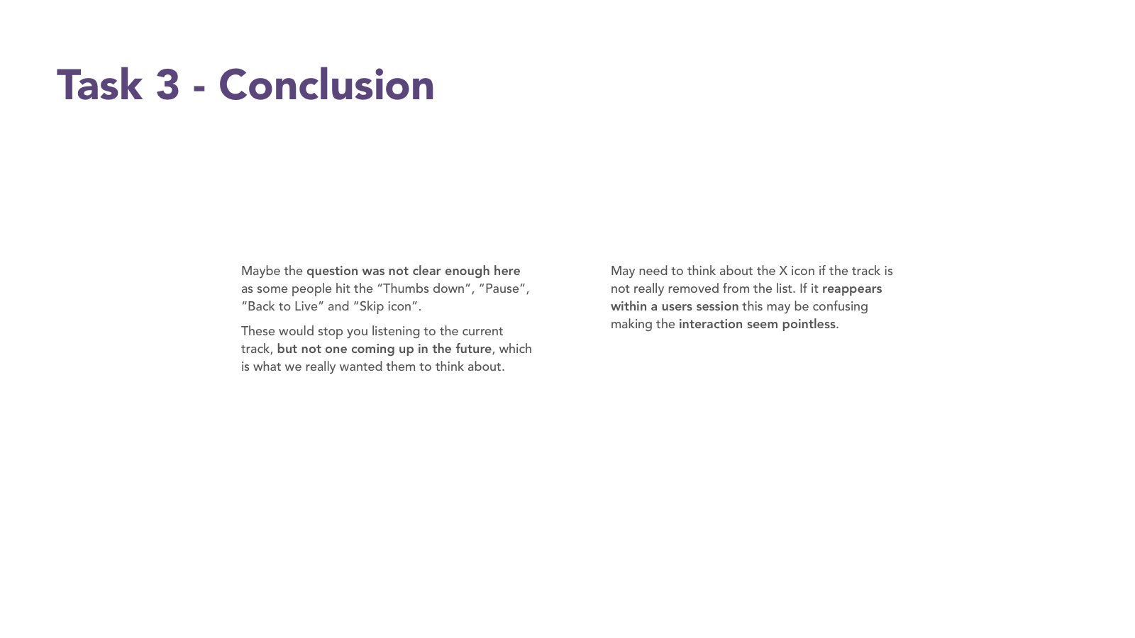
Feed back from the business had been that they wanted improve engagement with My Radio and therefore to make the CTA clearer on the new Live radio Playbar.
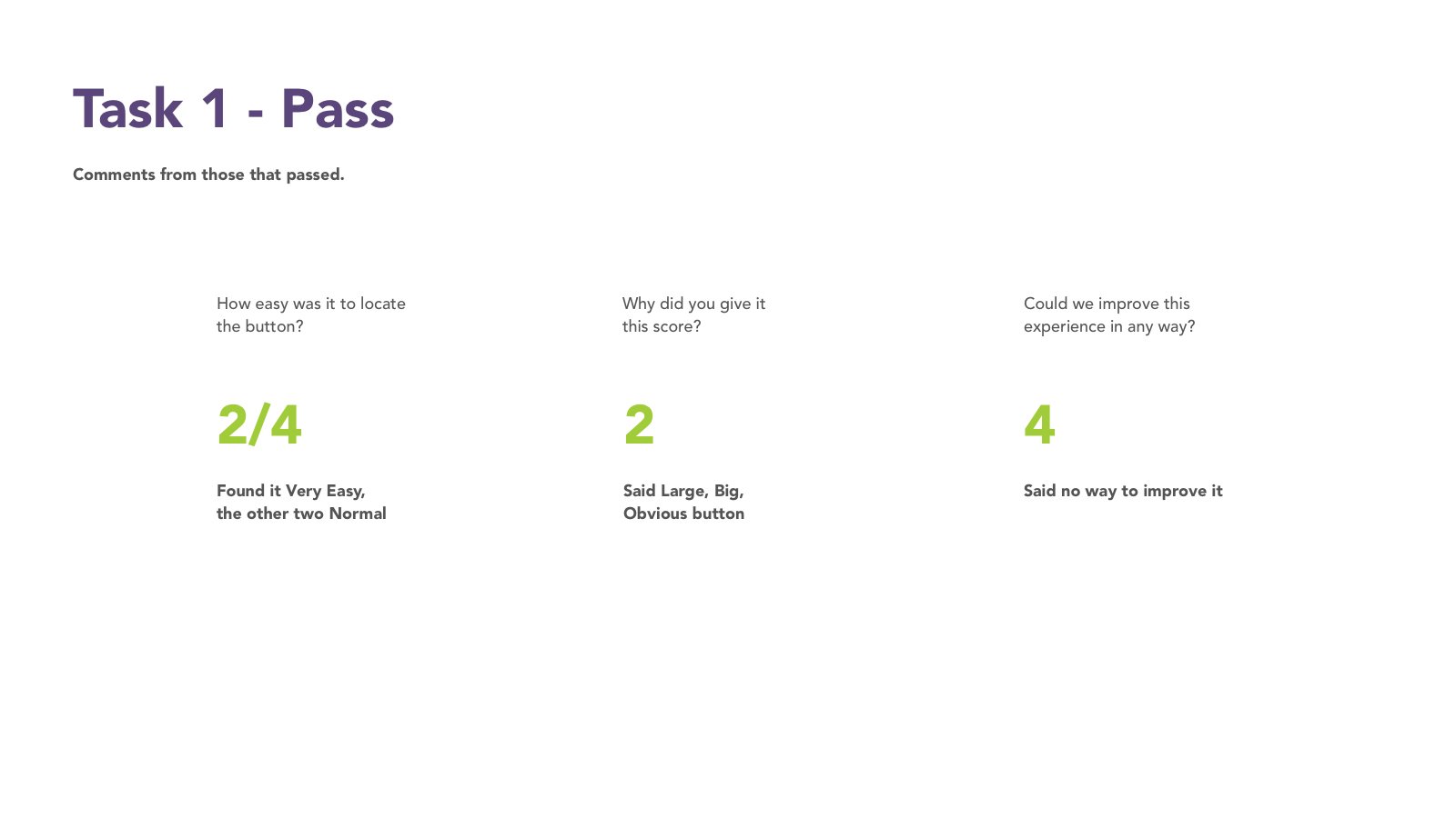
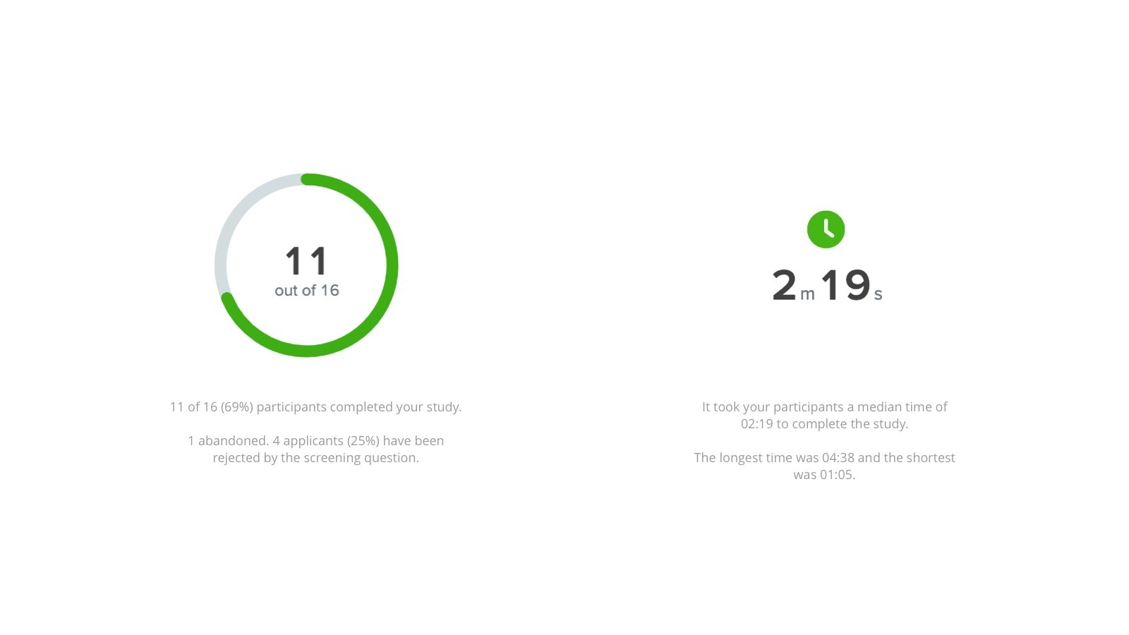
This went through some testing which is why I have added it here. Also it was quite fun to draft icons on my iPad for this.

Overview Of Designs
Eventlually as mention the project became more focuses on the fact that we need consistent playbars.
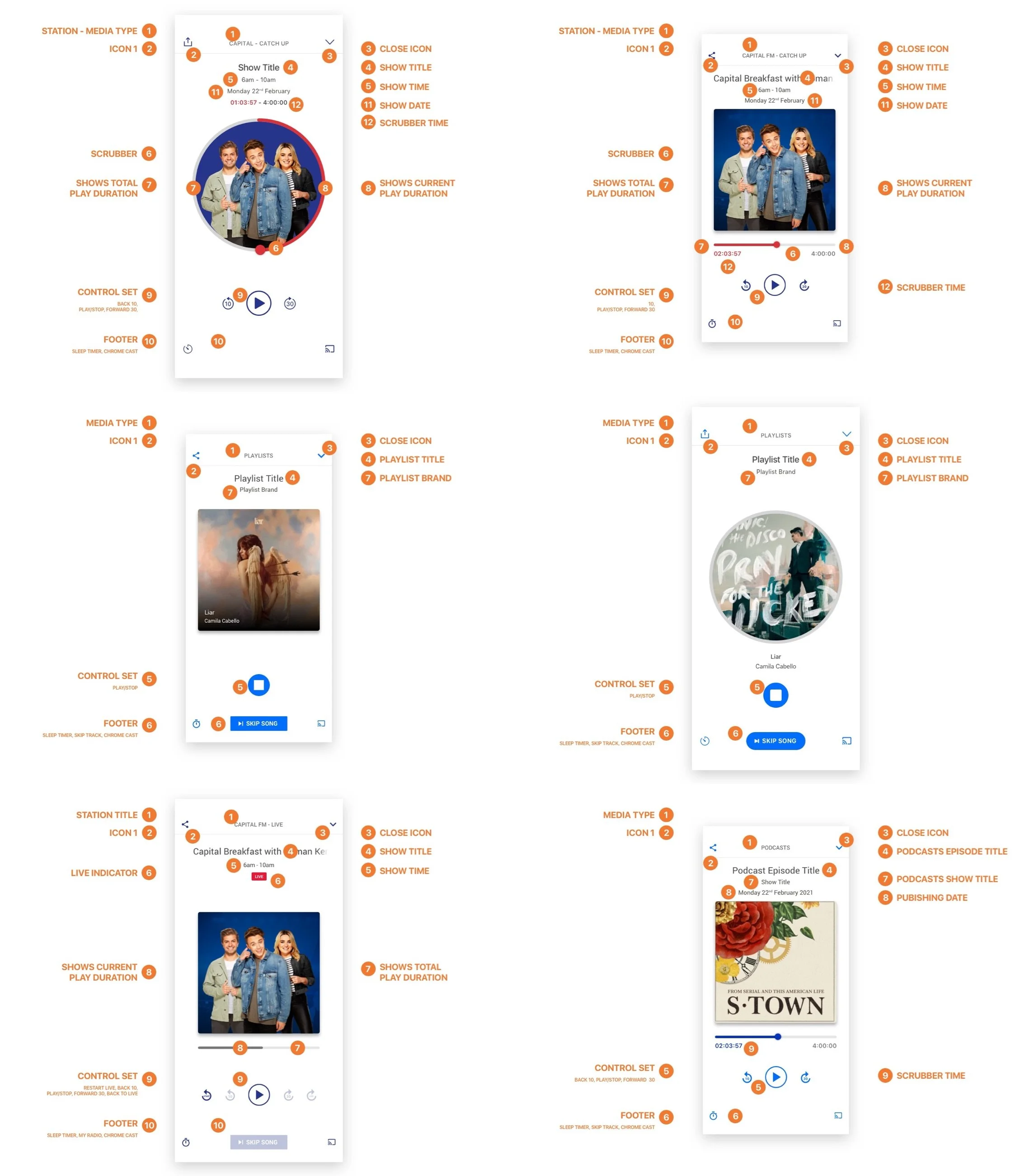
So after lots of work and lots of discussion we started to design all the playbars UI across all media stated for all platforms for all brands.
No easy task.
IOS Overview Screens
Android Overview Screens
Implementing Brand Theming
At Global most of what we have to do needs to be duplicated in serval times to at minimum cover some of our core key brands and their theming.
This then multiplied by device resolution and platform can become mammoth so we have to be careful how we deliver.
At the very end of this project brand theming was actually removed by senior stakeholders and we decided to theme all playbars with Global Player theming making the cor UI blue.
IOS Mobile Brand Themed
IOS iPad
IOS Screen Resolutions
All Playbar Media Scenarios
Summary #YouMadeIT
So in short. This started off as one thing with a lot of business focus on a single idea and became a wider improvement.
Delivering consistent play experiences with better features, attractive UI and cross platform continuity.
Since the first release the playbars have had items such as Sharing, Sleep Timer, Casting, Alarm clock and there are more to come because they have this home.


